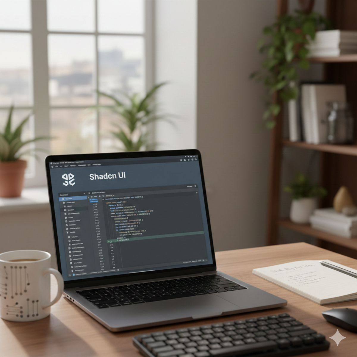
Shadcn/UI: React Components, Tailwind CSS, & Customization Bliss
Building beautiful and consistent user interfaces in React can be a time-consuming process. Enter Shadcn/UI, a rising star in the React ecosystem that offers a delightful approach to UI development.
What is Shadcn/UI?
Shadcn/UI is not your typical component library. It's a collection of meticulously crafted, customizable React components that embrace the power of Tailwind CSS. Instead of imposing a rigid design system, Shadcn/UI provides a flexible foundation, allowing you to tailor the components to perfectly match your application's unique aesthetic.
Why Choose Shadcn/UI?
- Tailwind CSS Integration: Shadcn/UI components are built with Tailwind CSS, enabling you to leverage its utility-first approach for styling and customization.
- Unparalleled Customization: Modify colors, spacing, typography, and more with ease, ensuring your UI reflects your brand identity.
- Accessibility: Components are designed with accessibility in mind, adhering to best practices for a wider audience.
- Open Source and Community Driven: Shadcn/UI is an open-source project with a growing community, fostering collaboration and continuous improvement.
- No Runtime Overhead: Unlike traditional component libraries, Shadcn/UI avoids runtime overhead by providing components as source code that you integrate directly into your project.
Getting Started with Shadcn/UI
Install with the CLI:
npx shadcn-ui@latest initChoose your preferences:
The CLI will guide you through selecting a framework (Next.js, Remix, etc.), a styling preference (default or new-york), and whether you need dark mode support.
Add Components:
npx shadcn-ui add ButtonThis will add the Button component to your project.
Customization
Shadcn/UI makes customization a breeze. You can:
- Override Tailwind classes: Use Tailwind's className prop to modify the appearance of components.
- Create custom themes: Define your own color palettes, fonts, and other styles to apply globally.
- Use the theme editor: Shadcn/UI provides a visual theme editor for easy customization.
import { Button } from "@/components/ui/button"

export default function Home() {
  return (
    <Button variant="outline" className="bg-blue-500 hover:bg-blue-700">
      Click me
    </Button>
  )
}Beyond the Basics
Shadcn/UI offers more than just basic components. You'll find:
- Layout components: Build complex layouts with components like grids and stacks.
- Form elements: Create forms with inputs, selects, and textareas.
- UI primitives: Access low-level building blocks for even more granular control.
Conclusion
Shadcn/UI is a game-changer for React developers who value customization and Tailwind CSS. Its focus on flexibility, accessibility, and performance makes it an ideal choice for building modern and stylish user interfaces.
Resources
- Shadcn/UI Website: https://ui.shadcn.com/
- GitHub Repository: https://github.com/shadcn/ui
- Documentation: https://ui.shadcn.com/docs
Related Blogs

What is Typst a brief tutorial
Typst is the modern answer to that struggle. Written in Rust, it’s a markup-based typesetting system that is as powerful as LaTeX but as intuitive as Markdown. In this tutorial, we’ll walk through the basics of Typst so you can go from a blank page to a professional PDF in minutes.
Read More
Understanding Rust's Ownership and Borrowing
Dive deep into Rust's core concepts of ownership and borrowing to understand how they ensure memory safety and prevent data races. Learn key rules, benefits, and challenges.
Read More
Supercharging Asynchronous Rust with Tokio
Learn how to supercharge your asynchronous Rust applications with Tokio, a high-performance runtime for concurrent programming. Master efficient network services and parallel processing.
Read More